Rhythm analysis, part 2

As mentioned in the rhythm analysis part 1 , one of our goals at this point has been to try to find methods of rhythmical analysis that work without assumptions about pulse and meter, and also as far as possible without assumptions about musical style. As our somewhat minimal rhythm definition  we look at rhythm as time ratio constellations , patterns of time ratios . Here we will make an assumption (yes, something must be assumed)  regarding patterns of time durations: Recurring or repeated patterns have another perceptual quality than constantly shifting combinations of time durations. We could also assume that recurring or repeated patterns have stronger perceptual influence, but technically, it does not matter so much. The main issue is that we can measure some difference in quality. Quality here does not imply that something is better, just that something is different.

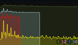
FFT of modified amplitude envelope

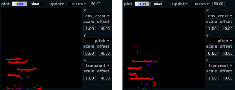
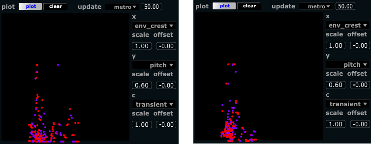
To measure how much recurrence there is in a signal, we can use autocorrelation. Repeated patterns will show up as peaks in the autocorrelation, and the period of repetition will be shown as the position of the peaks. Longer repetition periods give peaks further away (commonly further to the right when graphing the autocorrelation). To calculate the autocorrelation, we could use the FFT of the amplitude envelope as our basis. However, the unmodified envelope can have many variations at frequencies not related to the actual rhythms. For example, the amplitude envelope of a signal with fast transients (e.g. percussion, piano) show much more high frequency content than a signal with slow transients (e.g. many wind instruments). For this reason, we opted to use a modified envelope for the FFT in connection with the rhythm autocorrelation measure. The modified envelope is generated by using transient detection, triggering a short gaussian envelope scaled to the current amplitude of the signal. This way, we achieve a consistent envelope across different instruments, preserving the relative amplitude differences between transients (since we assume dynamics to be relevant to rhythm, for example in using accents to signify grouping of events).

Time spans and latency

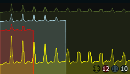
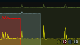
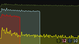
One question to ask when analyzing for recurring patterns is “how long patterns are we looking for?” . One could say that a musical pattern sometimes will repeat relatively quickly, say once every second. Other times we can have arbitrary long patterns (sometimes very long), but for practical purposes, lets assume a maximum length of somewhere around 10 seconds. Now, if we want to analyze for such long patterns (10 seconds), an inherent limitation of any technique used would imply that it takes at least so many seconds to give an answer to whether there is a repeating pattern of that duration. Analyzing for 1-second patterns, we can have an indication after 1 second, and we can be sure after 2 seconds. For a musically responsive analysis, we’d like as low latency as possible, and in any practical case a latency of 10 seconds or more is not particularly responsive. Still, if the analysis window is shorter, we will not be able to detect longer patterns. One common method in FFT is to use overlapping windows, meaning that we update our analysis several times (with new data) within the time span defined by one analysis window. This will give us updated data more frequently, but still the longer patterns will only partially be influencing the output until a full period has passed. To alleviate this, we used 3 analysis durations running in parallel layers (each with overlapping windows as previously described). The longest time span is set to 10 seconds, layered onto this is a time span of 5 seconds, and layered on top of this again a 2.5 second time span. The layers are mixed down using a weighted sum that give precedence to more recent data while retaining the larger time span context. The shortest time span layer will be updated twice as often as the medium time span layer, and this again is updated twice as often as the longest time span layer. When we have a new frame of the longer time span, we will also have a new frame of the short time span ,these are then weighted 2/3 and 1/3 respectively. At the next available frame for the shorter time span, we weigh the new frame 2/3, and the longer frame 1/3. This is combined similarly for all the 3 layers to form the final autocorrelation coefficients. These are shown as a graph in the GUI.

rhythmcorrgraph1
3-layer rhythm autocorrelation. The red line is the shortest FFT, Light blue is the medium, Green is the longest. Yellow line is the weighted sum. This figures shows a steady rhythm played statically over the full duration of the longest FFT layer (10 seconds).
rhythmcorrgraph2
3 layer rhythm autocorrelation, as above. Here we see the recently played faster rhythms, with the long time span showing the static slower pulse. The combined correlation (yellow) has both features.

rhythmcorrgraph3
3 layer rhythm autocorrelation, as above. Showing a more randomly spaced non-repeating rhythm.
rhythmcorrgraph4
As above. Recently played steady fast rhythms after a period of randomly spaced non-repeating activity

Features under development

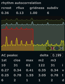
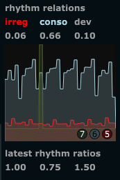
We have assumed that we could use the exact position of the peaks to detect the duration of repeated patterns . This is partly true, since fast rhythms (short repetition duration) give tightly spaced peaks, slow rhythms give sparsely spaced peaks. It seems so far, however, that the exact position and amplitude of each peak is not really stable enough to just use these values for that purpose. We use a peak picking algorithm to detect the highest peak, the second and third highest peak, and also the peak closest in time to the maximum peak and the first (earliest, leftmost) peak. In situations where the rhythm is quite static, these values correspond well to the repetition durations and the relative strength (in dynamics) of different repeating patterns. For most practical situations however, this specific application of the rhythmic autocorrelation does not really work that well (yet!). Another way of using these values could be to determine the degree to which the rhythmic events can be placed on a grid. We have termed this gridness . It is calculated by taking the maximum peak as the reference duration, then looking at the other detected peaks, and checking if we can find some relatively simple integer ratio between the max and each other peak. For example, if we have a max peak at 6 seconds, and then a second highest peak at 4 seconds, the ratio would be 3:2. In this case we construct a grid of 1/3 durations of the max peak across the whole time segment (1/3, 2/3, 3/3, 4/3, 5/3 … and so on as far as we can go), and see how many of all detected peaks correspond to grid locations. The process is repeated for each integer ratio found between the max peak and the lesser peaks. The grid with the maximum number of corresponding events wins, and is reported as the current rhythmic subdivision . The number of peaks that fall on this grid is divided by the number of detected events, resulting in the gridness value. If all detected events fall on grid locations, the gridness will be 1.0, if half of the events fall on the grid the gridness will be 0.5. The gridness measure does not currently work very well, due to the instability of the peaks as described above. This is an area of the analyzer where substantial refinement can take place. The resulting metrics (if working) however, seems intuitively to make sense; Measuring  periods of repetition, subdivisions of these, and the degree of consistence with the assumed grid of subdivisions.

So what can we actually use it for now?

Following up on a suggestion from Miller Puckette, we tried to look at more general features of the correlation graph, to extract some global descriptors of the current rhythmic activity. We turned to well known statistics like crest and flux .
The crest factor describing how “peaky” the signal is, that is the relation between the highest peak and the overall effective amplitude. Traditionally the crest would be calculated as the peak value divided by the rms (root-mean-square) amplitude. However, our use here is somewhat different than both the regular envelope crest and the spectral crest. For this specific purpose, we found it better to divide the rms value by the number of transients detected. This may at first seem counterintuitive, but can be explained by the fact that repeated patterns of the same duration creates many events that fall on the same peak locations in the autocorrelation, effectively making those peaks stronger. The division on the number of peaks detected avoids the exessively high crest values we could get if there was a single peak in the correlation. As such it gives a measure of the amount of repetition. It could be discussed whether we should use another term for this feature, to avoid confusion between this and the other creest measures.
The flux generally describes the amount of change from frame to frame, so static patterns will have low flux while constantly shifting rhythms will have high flux. The flux is calculated similarly as it would be for spectral flux (multiplying each value in a frame with the corrresponding value in the previous frame, accumulating the result and then normalizing it). This is done with a slight twist in our implementation; Because of the instability in the peaks’ location we don’t just multiply each value with the corresponding value of another frame, but we check if any neightbouring values have higher amplitude, and then use the maximum (this value or its neighbour on either side). We can think of this as the minimum possible flux. Empirical testing has shown it to be a more stable measure than the simpler variation of the flux measure.

rhythmautocorr_full
All results related to the rhythmic autocorrelation. The crest and flux are relatively reliable measures. The other ones subject to refinement. Note that the AC peaks in the lower half of the figure currently refers only to the long time span (green) autocorrelation.

Audio effect: Liveconvolver3

The convolution audio effect is traditionally used to sample a room to create artificial reverb. Others have used it extensively for creative purposes, for example convolving guitars with angle grinders and trains. The technology normally requires recording a sound, then analyzing it and then finally loading the analyzed impulse response (IR) into an effect to use it. The Liveconvolver3 let you live sample the impulse response and start convolving even before the recording is finished.

In the context of the crossadaptive project, convolution can be a nice way of imprinting the characteristics of one audio source on another. The live sampling of the IR is necessary to facilitate using it in an improvised manner, reacting immediately to what is played here and now.

There are some aesthetic challenges , namely how to avoid everything turning into a (somewhat beautiful) mush. This is because in convolution all samples of one sound is multiplied with every sample of the other sound. If we sample a long melodic line as the IR, a mere click of the toungue on the other audio channel will fire the whole melodic segment once. Several clicks will create separate echoes of the melody, and a coninuous sound will create literally thousands of echoes. What is nice is that only frequencies that the two signals have in common will come out of the process. So a light whisper will create a high frequency whispering melody (with the long IR described above), while a deep and resonant drone will just let those (spectral) parts of the IR through. Since the IR contains a recording not only of spectral content but also of its evolution over  time, it can lend spectrotemporal morphing features from one sound to another. To reduce the mushyness of the processed sound, we can enhance the transients and reduce the sustained parts of the input sound. Even though this kind of (exaggerated) transient designer processing might sound artificial on its own, it can work well in the context of convolutions. The current implementation, Liveconvolver3, does not include this kind of transient processing, but we have done this earlier so it will be easy to add.

There are also some technical challenges to using this technique in a live setting. These are related to amplitude control, and to the risk of feedback when playing on larger speaker systems. The feedback risk occurs because we are taking a spectral snapshop (the impulse response) of the room we are currently playing in (well, of an instrument in that room, but nevertheless, the room is there), then we process sound coming from (another source in) the same room. The output of the process will enhance those frequencies that the two sources have in common, hence the characteristics of the room (and the speaker system) will be amplified, and this generally creates the risk of feedback to arise. Once we have unwanted feedback with convolution, it will also generally take a while (a few seconds) to get rid of, since the nature of the process creates a revereb-like tail to every sound. To reduce the risk of feedback we use a very small frequency shift of the convolver output. This is not usually perceptible, but it disturbs the feedback chain sufficiently to significantly reduce the feedback potential.

The challenge of the overall amplitude control can be tackled by using the sum of all amplitudes in the IR as a normalization factor. This works reasonably well, and is how we do it in the liveconvolver. One obvious exeption being in the case where the IR and the input sound contains overlapping strong resonances (or single lone notes). Then we will get a lot of energy on those overlapping frequency regions, and very little else. We will work on algorithms to attempt normalization in these cases as well.

The effect

liveconvolver3_reaper_setup
Liveconvolver3 in an example setup in Reaper. Note the routing of the source signals to the two inputs of the effect (aux sends with pan).

The effect uses two separate audio inputs, one for the impulse response sampling, and one for the live input to be convolved.  We have made it as a stereo effect, but do not expect it to convolve a stereo input. It also creates a mono output in the current implementation (the same signal on both stereo outputs). In the figure we see two input sources. Track 1 receives external audio, and routes it to an aux send to the liveconvolver track, panned left so that it will enter only input 1 to the effect.. Track 2 receives external audio and similarly routes it to an aux send to the liveconvolver track, but panned right so the audio is only sent to input 2 of the effect.

The effect itself has contols for input level, highpass filtering ( hpFreq ), lowpass frequency ( lpFreq ) and output volume ( convVolume ). These controls basically do what the control name says. Then we have controls to set the start time ( IR_start ) of the impulse response (allow skipping a certain number of seconds into the recording), and the impulse response length ( IR_length ), determining how many seconds of the IR recording we want to use. There are also controls for fading the IR in and out. Without fading, we might experience clicks and pops in the output. The partition length sets the size of partitioned convolution, higher settings will require less CPU but will also make it respond slower. Usually just leave this at the default 2048. The big green button IR_record enables recording of an impulse response. The current max duration is 5.9 seconds at 44.1 kHz sampling rate. If the maximum duration is exceeded during recording, the recording simply stops and is treated as complete. The convolution process will keep running while recording, using parts of the newly recorded IR as they become available. The IR_release knob controls the amount of overlap between the new instances of convolution created during recording. When recording is done, we fall back to using just one instance again. Finally, the switch_inputs button let us (surprise!) switch the two inputs, so that input 1 will be the IR record and input 2 will be the convolver input. If you want to convolve a source with itself, you would first record an IR then switch the inputs so that the same source would be convolved with its own (previously recorded) IR. Finally, to reduce the potential of audio feedback, the f_shift control can be adjusted. This shifts the entire output upwards by the amount selected. Usually around 1 Hz is sufficient. Extreme settings will create artificial sounding effects and cascading delays.

Installation

The effect is written in the audio programming language Csound , and compiled into a VST plugin using a tool called Cabbage . The actual program code is just a small text file (a csd) that you can download here .

You will need to download Cabbage (the bleeding edge version can be found here ), then open the csd file in Cabbage and export it as a plugin effect. Put the exported plugin somewhere in your VST path so that your favourite DAW can find it. Then you’re all set.

cabbage_export_liveconvolver
Export as plugin effect in Cabbage

Routing in other hosts

As a short update, I just came to think that some users might find it complicated to translate that Reaper routing setup to other hosts. I know a lot of people are using Ableton Live, so here’s a screenshot of how to route for the liveconvolver in Live:

liveconvolver3_live_setup
Example setup with the liveconvolver in Live

Note that

  • the aux sends are “post” (otherwise the sound would not go through the pan pot, and we need that).
  • Because the sends are post, the volume fader has to be up. We will probably not want to hear the direct unprocessed sound, so the “Audio To” selector on the channels is set to “Sends only”
  • Both input channels send to the same effect
  • The two input channel are panned hard left (ch 1) and hard right (ch 2)
  • The monitor selector for the channels is set to “in”, activating the input regardless of arm/recording

Whith all that set up, you can hit “IR_record” and record an IR (of the sound you have on channel 1). The convolver effect will be applied to the sound on channel 2.

Analyzer: plotting and new parameters

During the last few weeks, I’ve added some new things to the analyzer. Some new feature extraction parameters, some small fixes, and also a 2D plotting of parameters. The plotting makes it much easier to see correlations between extracted features, and as such is valuable both to familiarize oneself with the feature extraction methods, but also in the work of cleaning out redundant analysis parameters. First to the new parameters:

Envelope crest factor : This is what one would normally call just crest factor in audio engineering, but since we use the same kind of measure on different dimensions, we will use envelope crest factor or jus envelope crest as its name. The crest factor is technically the peak value divided by the RMS value, in this case of the amplitude envelope. This ratio of the peak to the average value gives an indication of the range of activity. In our project we also measure the crest factor of other dimensions, like the spectral crest, and the crest of the rhythmic autocorrelation. For our purposes, we can use the envelope crest factor to determine the “percussiveness” of a signal; if the audio signal is dry and staccato, with short attacks and clear pauses between them, then the envelope crest will be high. For sustained tones (and for silence), the envelope crest will be low. The initial experimentation with this parameter has led med to wish for another variant of it, an active dynamic range analysis, where one could distinguish between clear staccato rhythms with a high degree of dynamics (as opposed to staccato rhythms with a stable/steady dynamics).

Transient density: Now got a better algorithm for calculating this analysis parameter. It reflects the number of transients per second, and will naturally fluctuate a bit. A filter with fast rise and slow decay time has also been applied to it, so it will slowly dwindle back to zero when activity stops.

Plotting

The analyzer now has a 2D plotting area, inspired from seeing that Miller Puckette did something similar when we experimented with some analysis methods in PD. The plot does not have a control function, so does not actually produce any modulation data by itself, rather we can use it to look at how the signals behave over time. We can also see how different analysis features correspond to different kinds of playing, leaving different traces in the plot. The ability to see how much the different analysis features correlate also makes it easier to find which features are relevant for use as modulators and which ones perhaps is redundant. We can plot signals along 3 dimensions: x, y, and colour. The X axis goes from left to right, the Y axis from bottom to top, and the colour follows the rainbow from red to blue (maxing out at violet).

Plotting is enabled by clicking the button “not” (changing it into “plot”), and it can be cleared with the clear button. The plot has a set maximum of items it can plot (currently 200, although this can be set freely in the analyzer.csd code). When the maximum number of items has been plotted, we begin re-using the available items. This creates a natural decay of the plotted values, as older values (200 measurements ago) will be replaced by more recent ones. The plot update method can be set to be periodic (metro), with a selectable update rate (number of points per second). Alternatively, it can be set to plot values for every transient in the audio signal. In the case of the transient triggered plotting, the features of interest may not have stabilized at the exact time of the transient. For this reason we added a selectable delay (plot the value reached N number of milliseconds after the transient). Here’s some screenshots; First two situations of long, quite steady, held notes; Then two situations of staccato fluctuating melodies. The envelope crest is plotted on the X axis, the pitch on the Y axis, and the transient density represented by colour.

analyzer_plot_steadynotes_both
Plot of two situations with long steady notes

analyzer_plot_staccatonotes_both
Plot of two different situations with staccato fluctuating notes

Measuring “pressedness” of a timbre by Mel freq cepstrum difference

We have been searching for some way of extracting perceptually significant timbral qualities. One such quality could be the “pressedness” or “tension” of a sound. One could think of this similar to the amount of effort or energy put in by a performer of the sound. Some sort of musical intensity of intention. The term is a bit vague, but we assume it could be musically useful to be able extract such a timbral pressedness.

When playing around with the display of the first few bands (4-5 band) of the Mel frequency cepstrum coefficients (MFCC), I noticed that certain sounds would make certain unique distributions (shapes one could say) between these bands. Lets look at for example the first few MFCCs of a relaxed vocal “a”, and compare it to the same image of a pressed “a”.

mfccdiff_a_relax_pressed
Relaxed (left) and pressed (right) “a”

Then similarly for a relaxed and a pressed vocal “i”:

mfccdiff_i_relax_pressed
Relaxed (left) and pressed (right) “i”

As we can see the relaxed sounds are relativelly flat in the first few MFCC bands (except for the first one), but the more pressed sounds are more peaky. Even though the peaks will fall in different locations on different pressed sounds (and also fall differently is we change the MFCC analysis parameters), there is a clear indication that spiky shapes follow more pressed sounds. A more scientific way of explaining it would be that the formants are more pronounced, and thus creating peaks in the MF cepstrum. Now, lets look at a noisy “shhh” sound:

mfccdiff_shh_noise
Shh sound

Here we also notice a certain peakyness, but more notably, the first MFCC coefficient is very low. With the first MFCC indicating the first harmonic of the MF cepstrum, it correlates well with the general balance between low and high frequencies (higher values when we have more energy in the lows). Since the “shh” sound is quite flat, this will give a low MFCC1 value. Still, disregarding the actual placement of the peaks, and generalizing the “pressedness” of the sound, we could state that a noisy shh is a more pressed timbre than a tonal “a” for example.

So, as a simple way of getting a measure of the peakyness we can just simple sum the absolute difference of the first few MFCC bands and use this as our measure. This is what is shown in the images above as “mfccdiff”. For clarity, here’s the formula:

Now, this has so far only been tested on vocal input. I am confident that the differences will not be so clear on other instrumental signals. But it still seems a reasonable feature extraction method to include in further experimentation.

Rhythm analysis, part 1

Many of the currently used methods for rhythmic analysis, e.g. in MIR, makes assumptions about musical style, and for this reason does particularly well in analysing music within certain geographical and/or cultural origins. For our purposes we’d rather try to find analysis methods of a more generic nature. We want our analysis methods to be adaptable to many different musical situations. Also, since we assume the performance can be of an improvised nature, we do not know what is going to be played before it is actually performed. Finally, the audio stream to be analyzed is a realtime stream and this poses certain restrictions as we can not for example do multiple passes iterating over the whole song.

A goal at this point has been to try to find methods of rhythmical analysis that work without assumptions about pulse and meter. One such methods could be based just on the immediate rhythmic ratios between adjacent time intervals. Our basic assumption is then that rhythm consists of time intervals, and the relationship between these intervals. As such we can describe rhythm as time ratio constellations, patterns of time ratios. Moreover, simple rhythms are created from simple ratios, more complex rhythms from more irrational and irrregular combinations of time intervals. This could give rise to a measurement of some kind of rhythmic complexity, although rhythmic complexity may be made up of complexity in many different dimensions, so we need to come back to what we actually will use as a term for the output of our analyses. Then, sticking to complexity for the time being, how do we measure the complexity of the time ratios?
One way of looking at the time ratios (also grouping them into cathegories) is to represent them as the closest rational approximation. Using the Farey sequence , we can find the closest rational approximation with a given highest denominator. For example, a ratio of 0.6/1 will be approximated by 1/2 (1/2 = 0.5) , 2/3 (= 0.667), or 3/5 (= 0.6 exactly) depending on how high we allow the denominator to go. This way, we can decide how finely spaced we want our rhythm analysis grid to be. In the previous example, if we decided not to go higher than 3 for the denominator, we would only roughly approximate the actual observed time ratio but in return always get relatively simple fractions to work with. Deciding on an appropriate grid can be difficult, since the allowed deviation by human musical perception will often be higher even than the difference between relatively simple fractions (for example in the case of an extreme ritardando or other expressive timing). The perceived rhythm also being dictated by musical context. As the definition (or assertion) of musical context always will make assumptions about musical style, our current rhythmic analysis method does not take a larger musical context into account. We will however make a small local rhythmic context out of groupings of time ratios that follow each other. The current implementation includes 3 time ratios, so it effectively considers rhythmic patterns of up to 4 events as a rhythmic motif to be analyzed. This also allows it to respond quickly to changes in the performed rhythm, as it will only take 2 events of a new rhythmic pattern to generate a significant change in the output. This relative simplicity may also help us in narrowing down the available choices to making up a rhythmic grid for the approximations. If we regard only separate time ratios between neighbouring events, there are some ratios that will be more likely than others. Halving and doubling of tempo, tripling etc obviously will happen a lot, and more so, they will happen a lot more that what you’d expect. Say for example the rhythmic pattern of steady quarter notes followed by some steady 8th notes, then back to quarter notes:

rhythmn_484

Here, we will observe the ratio of 1/1 between the quarter notes, then the ratio 2/1 when we change into 8th notes, and then 1/1 for as long as we play 8th notes, and a ratio of 1/2 when we move back to quarter notes. Similarly for triplets, except we’d go 1/1, 3/1, 1/1, 1/3, 1/1.
Certain common rhythmic patterns (like a dotted 8th followed by a 16th) may create 3/4 and 1/3 ratios.

rhythmn_4_dot8_16_4

or with triplets, 2/3 and 1/2 ratios:

rhythmn_4_tripl4_tripl8_4

See, all these ratios express the most recent time interval as a ratio to the next most recent one. More complex relationships are also of course observed quite commonly. We have tried to describe ratios assumed to be more frequently used. The list of ratios at the time of writing is [1/16, 1/8, 1/7, 1/6, 1/5, 1/4, 1/3, 1/2, 3/5, 2/3, 3/4, 1/1] for ratios below 1.0, and then further [5/4, 4/3, 3/2, 5/3, 7/4, 2/1, 3/1, 4/1, 5/1, 6,/1, 7/1, 8/1, 12/1, 16/1].  The selection of time ratios to be included can obviously be the focus of a more in-depth study. Such a study could analyse a large body of notated/composed/performed patterns in a wide variety of styles to find common ratios not included in our initial assumptions (and as an excercise to the reader: find rhythms not covered by these ratios and send them to us). Analysis of folk music and other oral musical traditions, radical interpretations and contemporary music will probably reveal time ratios currently not taken into account by our analysis. However, an occational missed ratio will perhaps not be a disaster to the outputof the algorithm. The initial template of ratios let us get started, and we expect that the practical use of the algorithm in the context of our cross-adaptive purposes will be the best test for its utility and applicability. The current implementation use a lookup table for the allowed ratios. This was done to make it easier to selectively allow some time ratios while excluding others of the same denominator, for example allowing 1/16 but not 15/16. Again, it migh be a false assumption that the music will not contain the 15/16 ratio, but as of now we assume it is then more likely that the intended ratio was 16/16 boiling down to 1/1).

Rhythmic consonance

So what can we get out of analysing the time ratios expressed as simple fractions? A basic idea is that simpler ratios represent simpler relationships. But how do we range them? Is 3/4 simpler than 2/3? Is 5/3 simpler than 2/7? If we assume rhythmic ratios to be in some way related to harmonic ratios, we can find theories within the field of just intonation and microtonality, where the Benedetti height (the product of the numerator and denominator) or Tenney height (log of the Benedetti height) is used as a measure of inharmonicity. For our purpose we multiply the normalized Tenney height (with a small offset to avoid zeros for log(0)), of the three latest time intervals, as this will also help short term repetitions to show up as low inharmonicity. So if we take the inverse of inharmonicity as a measure of consonance, we can in the context of this algorithm invent the term “rhythmic consonance” and use it to describe the complexity of the time ratio.

Rhythmic irregularity

Another measure of rhythmic complexity might be the plain irregularity of the time intervals. So for example if all intervals have a 1/1 ratio, the irregularity is low because the rhythm is completely regular. Gradual deviations from the steady pulse give gradually higher irregularity. For example a whole note followed by a 16th note (16/1) is quite far from the 1/1 ratio so this yields a high irregularity measure. As a means of filtering out noise (for example due to single misplaced events), we take the highest two out of the last three irregularity measurements, then we multiply them with each other. In addition to acting like a filter, it also provides aa little more context than just measuring single events. Finally the resulting value is lowpass filtered.

Deviation

In our quantization of time intervals into fractions we may sometimes have misinterpreted the actual intended rhythm, as described above. Although we have no measure of how far the analyzed fraction is from the musically intended rhythm, we can measure how far the observed time interval is from the quantized one. We can call this rhythm ratio deviation , and it is expressed as a fraction of the interval between possible quantizations. For example if our quantization grid consist of 1/4, 1/3, 1/2, 2/3, 3/4 and 1/1 (just for the case of the example), and we observe a time ratio of 0.3, this will be expressed as 1/3 in the rhythmic ratio analysis since that is the ratio it is closest to. To express the deviation between the observed value and the quantized value in a practically usable manner, we need to scale the numeric deviation by the interval within which it can deviate before being interpreted as some other fraction.  Lets number the fractions in our grid as , that is, the first fraction is ,the second is , and so on. We call the actual observed time ratio and the quantized time ratio . The deviation can then be expressed as

in our case. If the observed ratio was rounded down when quantizing, the formula would use in place of :

The deviation measure is not reasonably used for anything musical as a control signal, but it can give an indication of the quality of our analysis.

The GUI

rhythm_ratios1

For the display of the rhythm ratio analysis, we write each value to a cyclic graph. This way one can get an impression of the recent history of values. There is a marker (green) showing the current write point, which wraps around when it reach the end. Rhythm consonance values are plotted in light blue/grey, rhythm irrregularity is plotted in red. The deviation and the most recent rhythm ratios are not plotted but just shown as number boxes updated on each rhythmic event.

Next up

Next post on rhythmic analysis will be looking at patterns on a somewhat longer time scale (a few seconds). For that, we’ll use autocorrelation to find periodicities in the envelope.